
The first step begins by gathering info from the client and researching outside sources for inspiration.
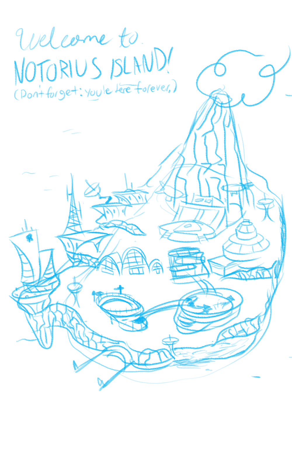
I make a couple roughs to send to see if I'm capturing exactly what the client wants. This way, I know that I'm doing exactly what they want before doing any more work. In this case, the client liked how I adapted his work in my style so much, that didn't have to do another round of roughs.
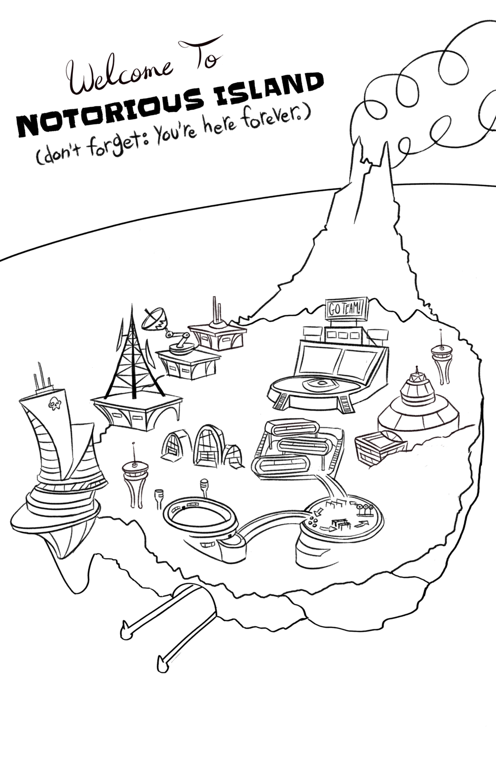
After getting approval, I ink the sketch so that I have a guide to look at later on. I also send this to the client, just to make 100% sure that everything was exactly how he wanted before I started coloring.
I begin by blocking the largest areas with a base color, so I can go back and build up on them later.
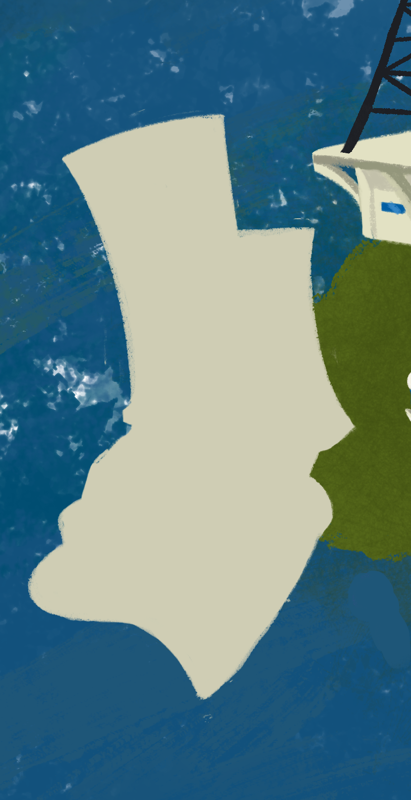
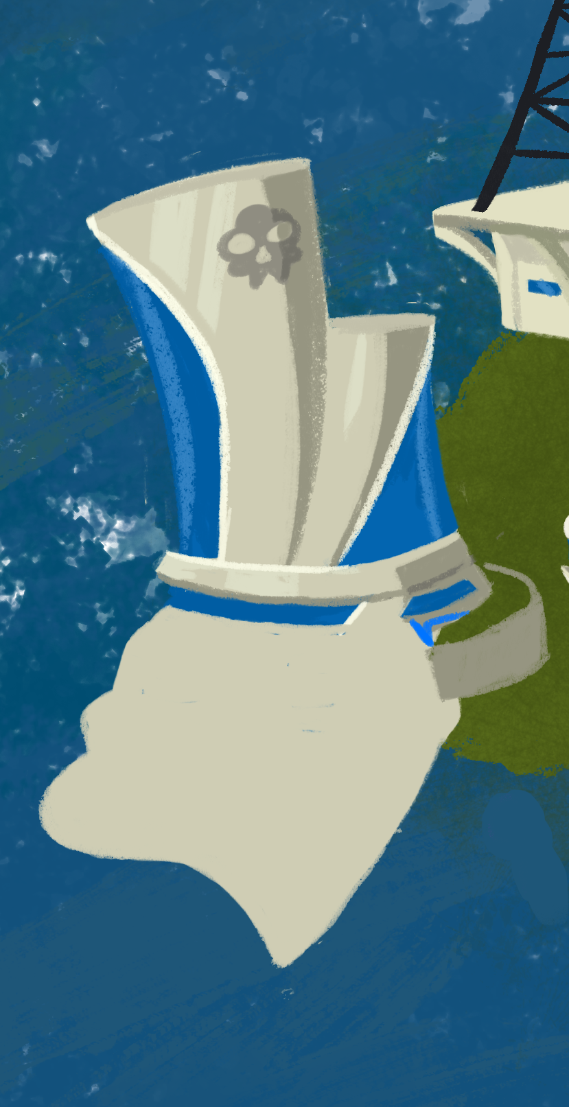
Using the inked line work as a guide, I start working on the first building by drawing a more detailed silhouette.

The #1 rule to adding in detail to a drawing has always been: Start Big, Then Go Small! With the gigantic windows in, I now have an easy landmark to work around.
With shading and highlights added on, the building is starting to look like an actual building.
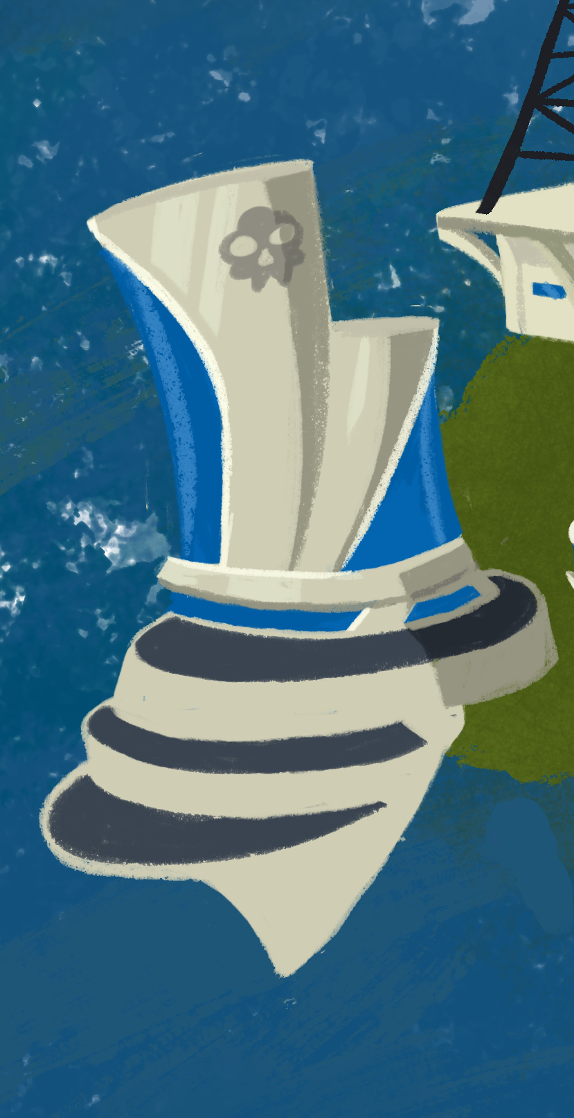
This includes drawing the balconies and adding more shading.
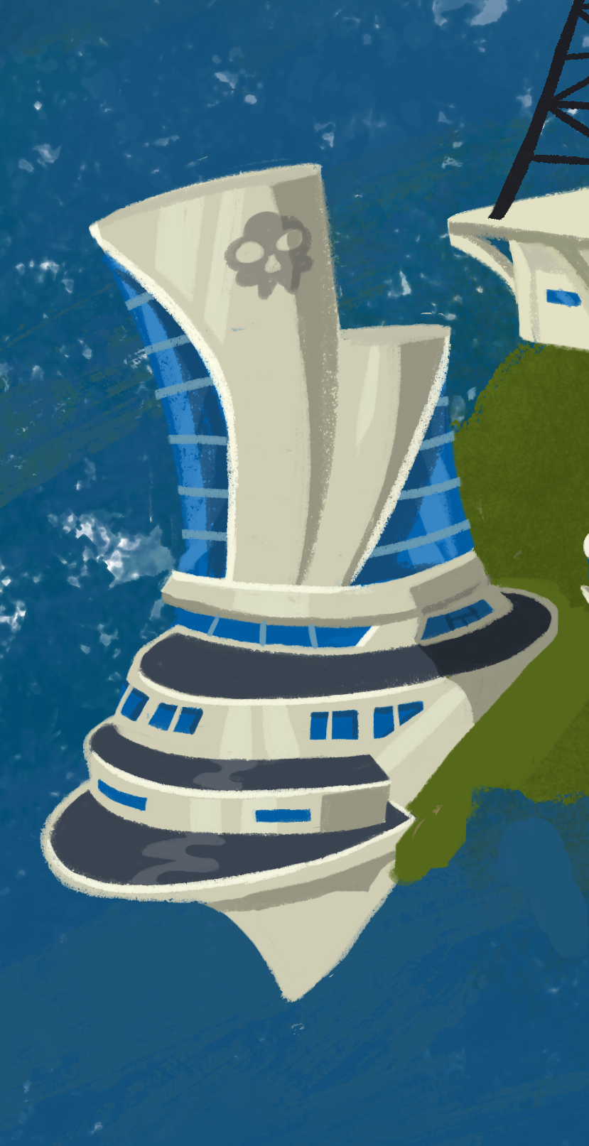
Now, onto the next buildings!
This step took a while!
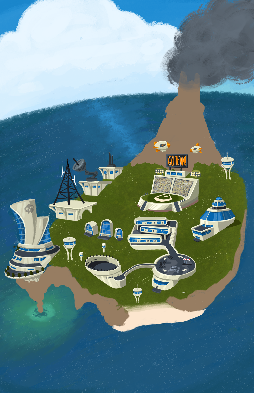
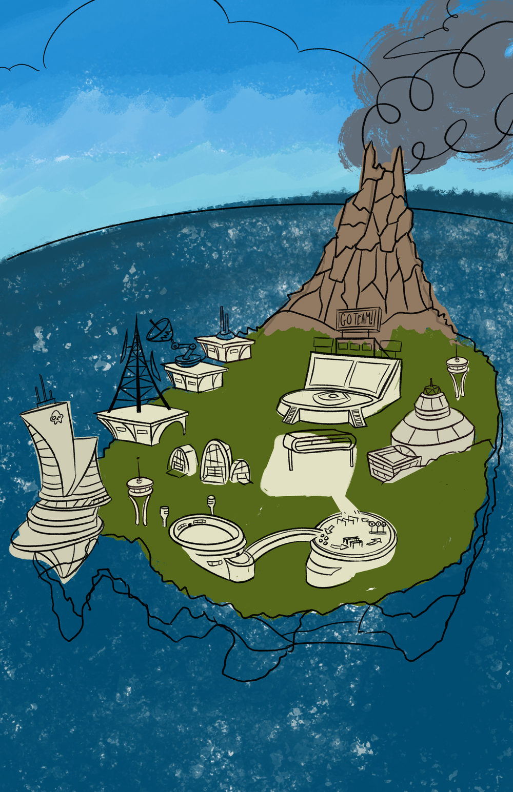
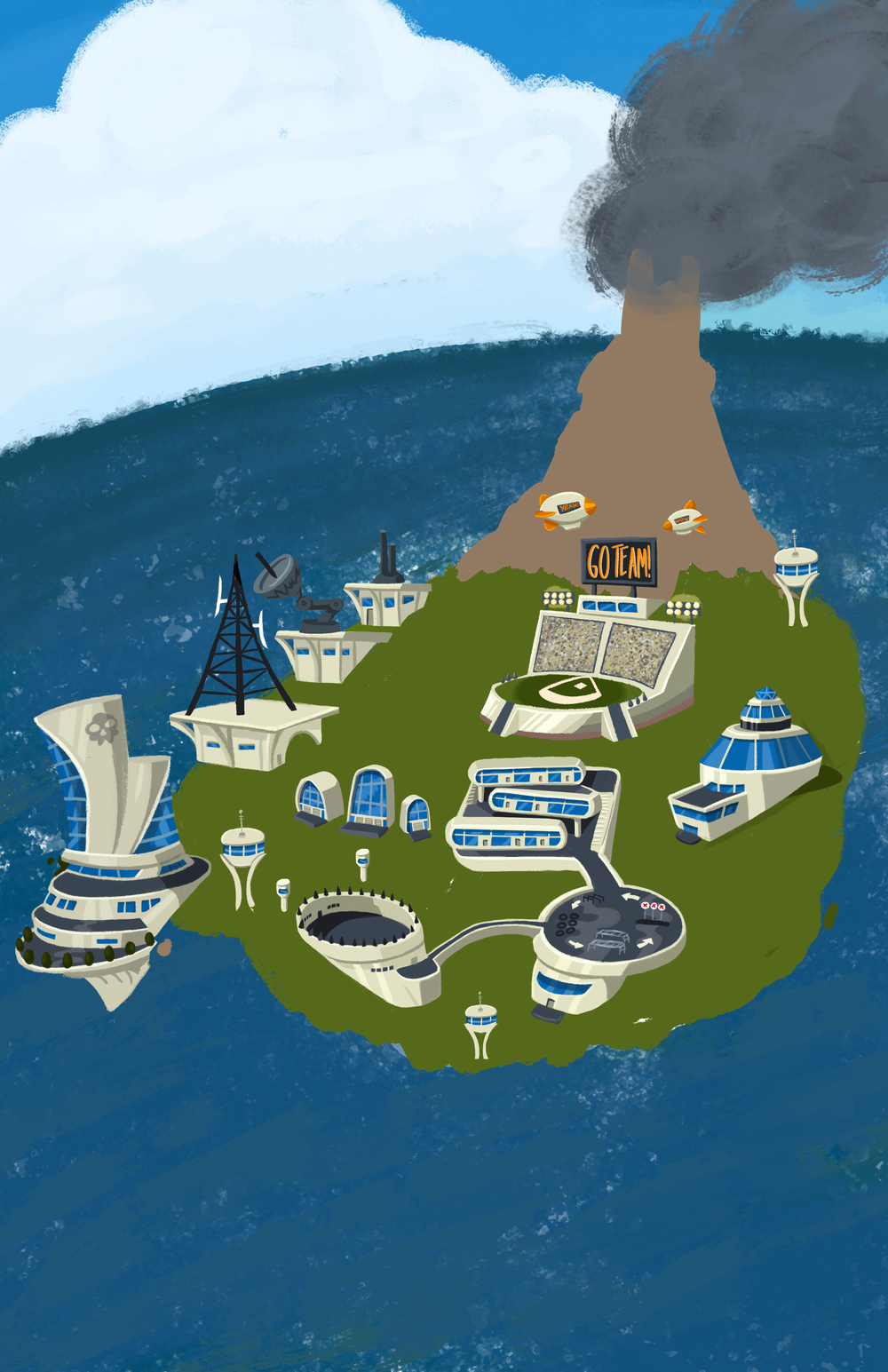
After finishing the buildings, I work on the rest of the map. The entire time I have another window open with the art the client sent me to make sure I'm getting both the style and colors right, especially for the water. I also add some flowers and texture to the grass to make it pop.
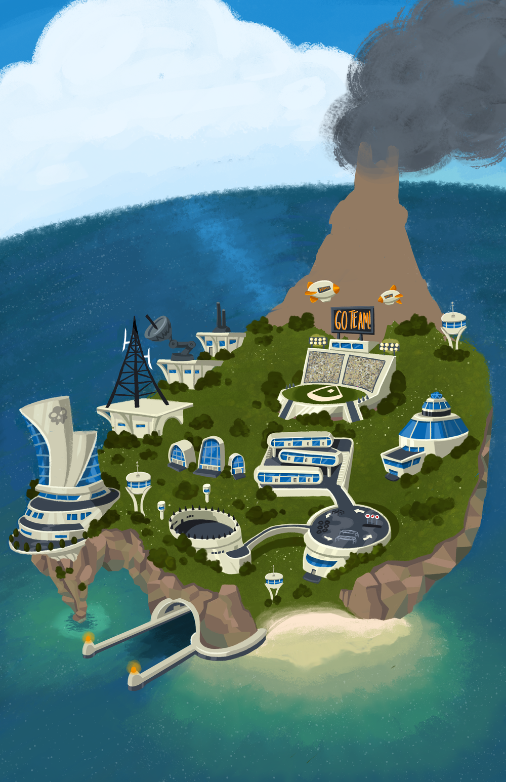
Now, I add in the details that brings the picture together. These include the cliffs, the beach and the docking bay. I start with the beach, smudging the colors to give it that "tropical sandbar at shallow tide" look.
The cliffs are next. I incorporate greens onto the rocks, to make it look like the water is being reflected onto them. I also try and draw the rocks in a more stylized, geometric pattern, to bring out a more "early 60's gouache amusement park map illustration" feel.
And, finally, I draw in the docking bay.
After the cliffs, I add the same geometric pattern to the face of the volcano. I also dab some red to top, so the volcano really looks like it's active and deadly.
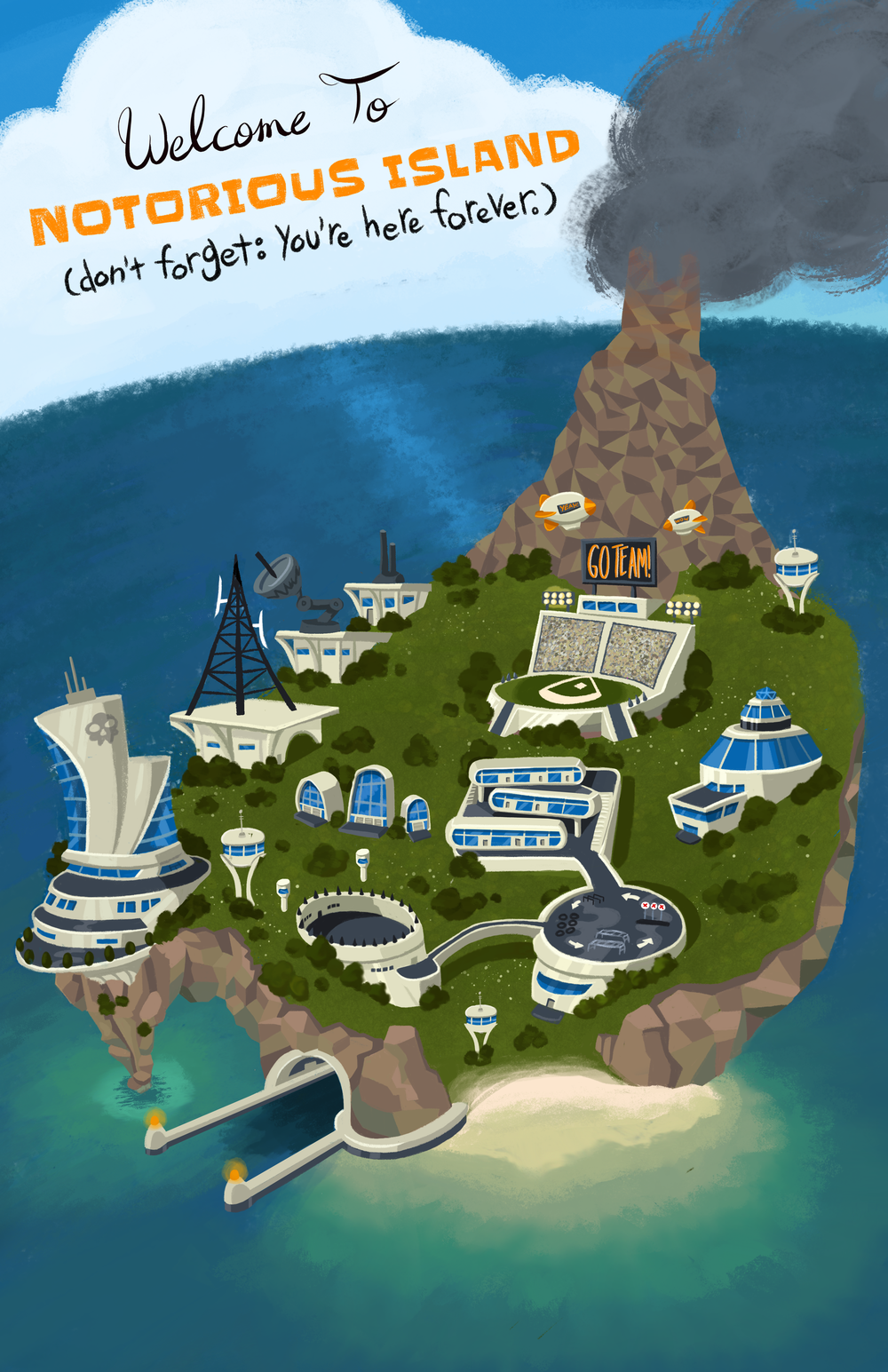
I do a final cleanup and make sure everything is presentable, and merge my layers down from 300 to a more manageable 30. The client wanted to be able to convert the picture from a vertical poster into a horizontal wallpaper, so I leave everything on its own separate layer and and check that every layer has a clear name.
And with that, I send the client the Photoshop file and I'm finished! Woo!